BRAND AUDIT | REPOSITIONING | IDENTITY REFRESH | WEBSITE | ART DIRECTION
Discovery Early Learning Centres
THE SITUATION
Discovery came to the team needing a brochure update. But when we looked closely at how they were presenting themselves, it was clear something bigger was off – their values and their visual identity weren’t telling the same story. They knew it too. A full brand audit was the right call, and they were ready for it.


WHAT WE DID
Working with the team, we ran workshops where we developed the tagline “in their nature.” Simple, true, and perfectly theirs – capturing both the natural Tasmanian environment Discovery is rooted in, and the philosophy that learning is something children do instinctively when given the right space. The repositioning work was a genuine team effort, and it gave me a strong creative foundation to build from.
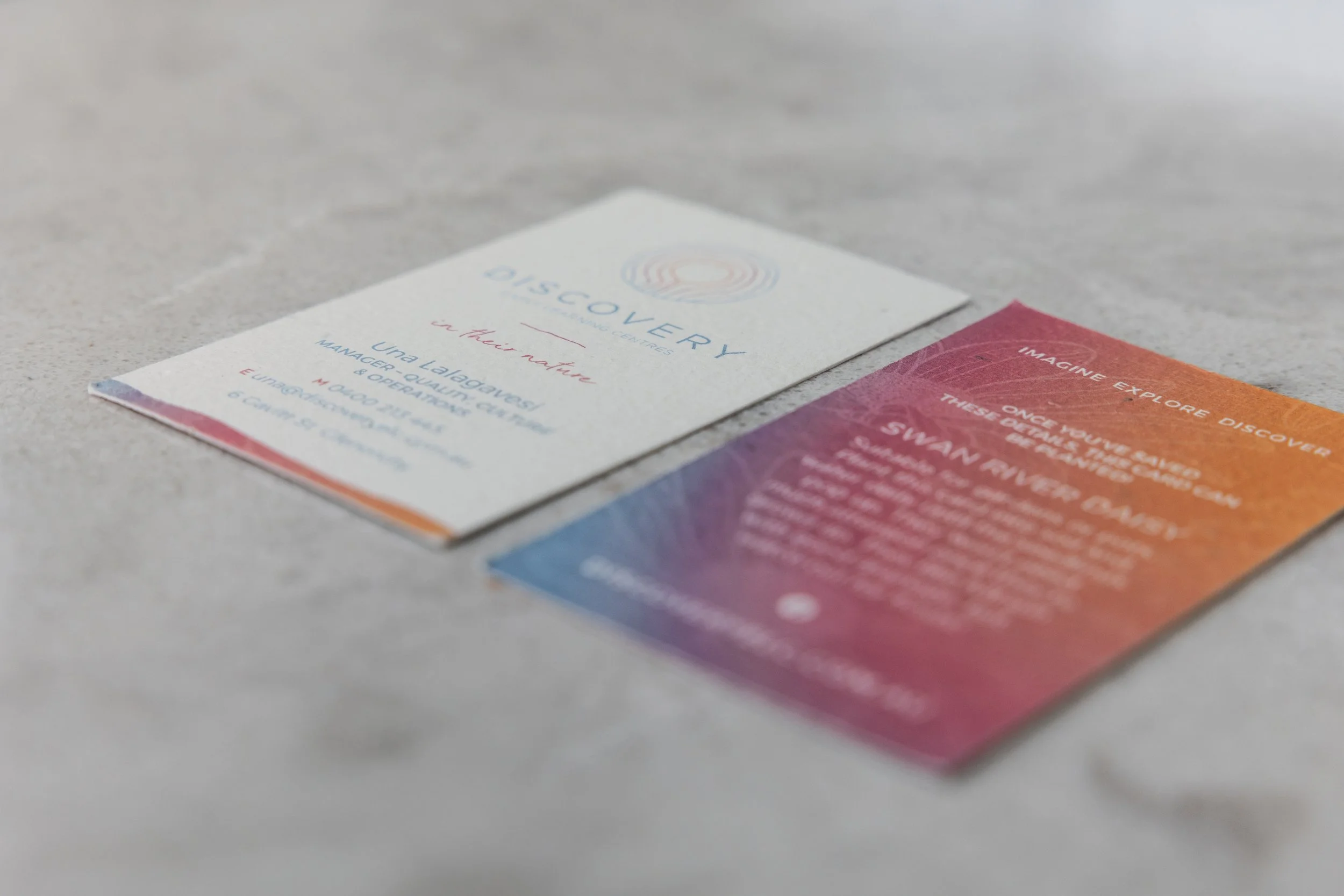
The identity concept I developed came to me virtually fully formed. Its concentric rings reference tree growth, the physical layout of the centres, the idea of a child at the centre of their own expanding world, and the warmth of community radiating outward. It’s doing a lot of quiet work.
We presented two distinct directions – a safe refresh, and the identity concept I’d developed. The client fell in love with it immediately, which is always the best outcome.
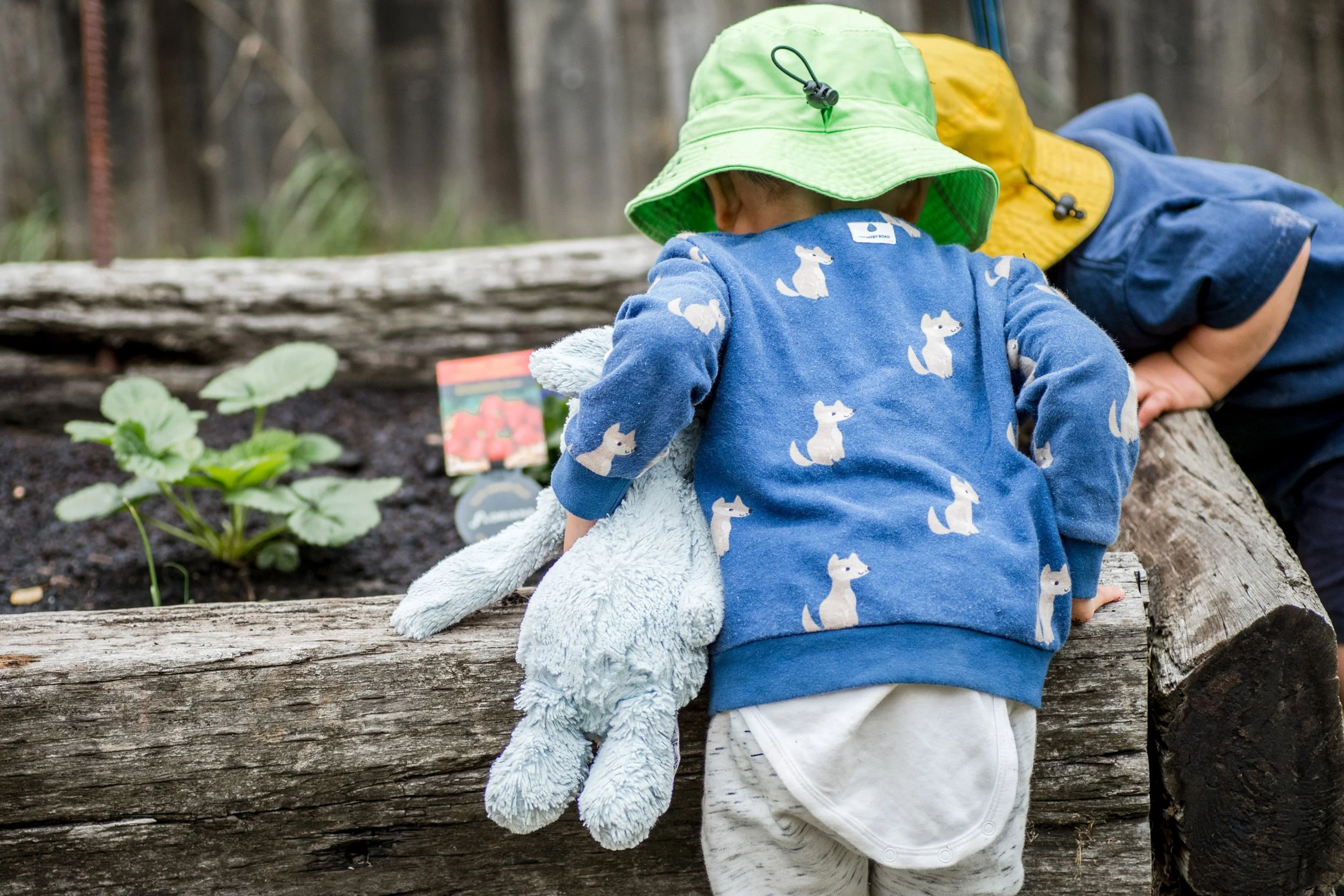
From there I designed a parent-focused website and art directed a photography shoot to build a flexible content library – setting Discovery apart in a sector that tends to look like it is designed only to appeal to children.

THE RESULT
The brand has rolled out across all Discovery centres and continues to grow as new locations open – which is really the best thing a brand system can do. But the outcome I’m most proud of is harder to put a number on: the team, the families, and the broader community genuinely embraced what the brand stands for. Staff started talking about “in their nature” as a cultural touchstone, not just a tagline. That kind of internal buy-in is what separates a logo from a living brand – and it doesn’t happen by accident.