BRAND REFRESH | STRATEGY | STAKEHOLDER ENGAGEMENT
Greenlife Industry Australia
THE SITUATION
Greenlife Industry Australia is the national peak body for greenlife production, supply and promotion – and like a lot of national bodies, it had the challenge of uniting state associations who each had their own strong sense of identity and their own ideas about what “national” should look like. Getting everyone pointing in the same direction required more than good design.
WHAT WE DID
I led the stakeholder engagement process, working with a team to run workshops, focus groups, and direct conversations with state bodies, growers and board members – the kind of groundwork that doesn’t show up in a finished logo but makes everything possible. The insight that kept surfacing was simple: people didn’t need to be convinced so much as heard. Once that happened, the path forward opened up.
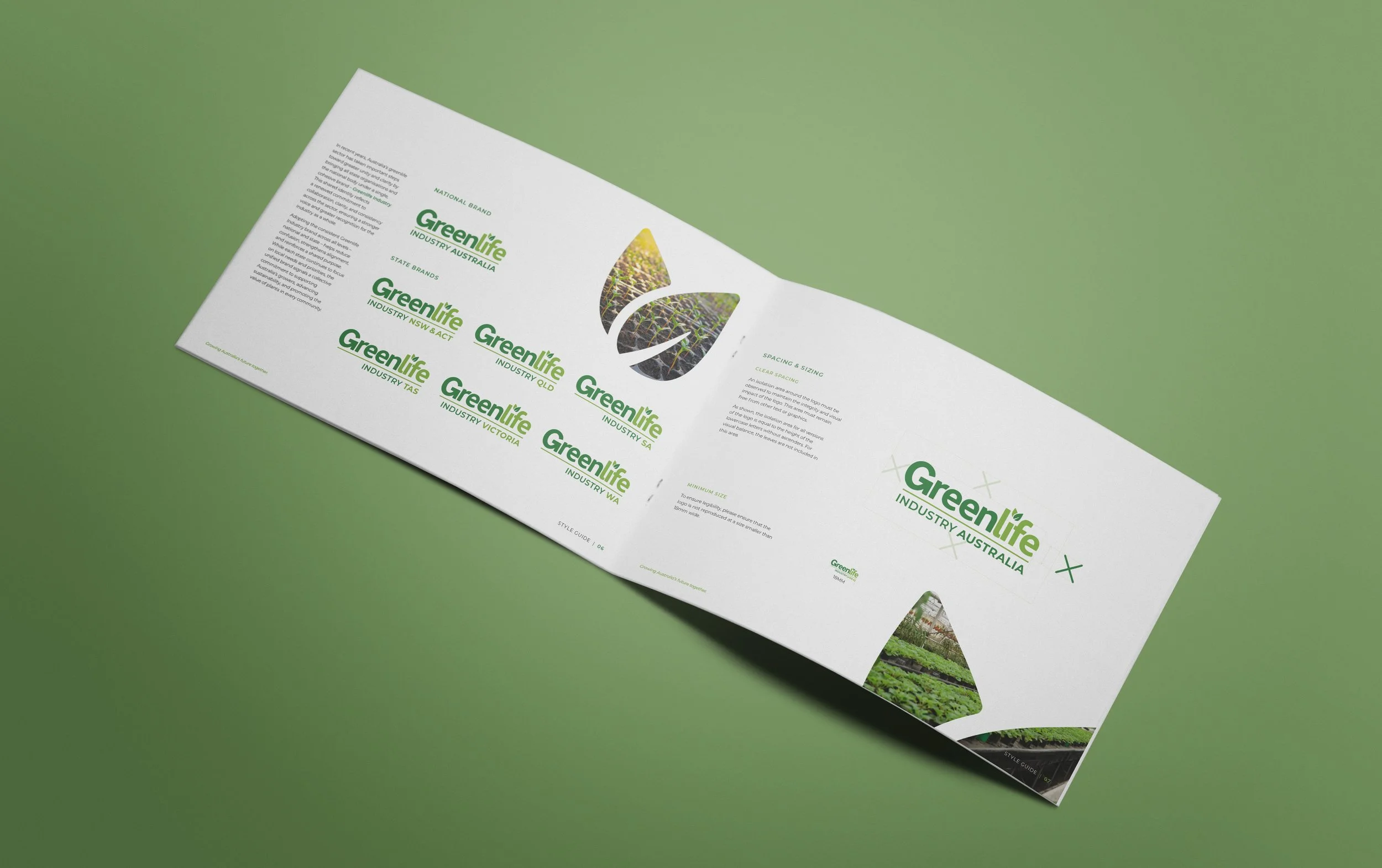
From there, I developed the brand strategy and creative refresh – building a logo system, style guide and collateral suite that had to work hard in both directions: flexible enough to give states breathing room, cohesive enough to present a confident national presence.
THE RESULT
For the first time, the national body and its state members are clearly aligned under a single, cohesive identity – which sounds straightforward until you consider how long that had been a sticking point. The practical impact is real: a unified presence makes the organisation more legible to the wider public, more credible to industry partners, and more coherent in how it advocates for the sector as a whole.

The style guide and accompanying collateral – business cards, letterheads and other key materials – brought the refreshed identity to life in a practical, easy‑to‑use format. The framework outlined logo use, colour, typography and layout principles to support consistent communication across both national and state teams.