
RENAMING | REBRAND | IDENTITY | WEBSITE
Enriched Care Solutions
THE SITUATION
Formerly Riverview Retreat, the organisation needed a new name and identity that better reflected its services and values – and that would genuinely resonate with the people it existed to support.

WHAT WE DID
This was one of those projects that stays with you. Designing for a disability services organisation means every decision carries real weight – the imagery, the language, the tone, all of it needs to feel considered and human. It was also, for exactly that reason, one of the most rewarding things I’ve worked on.
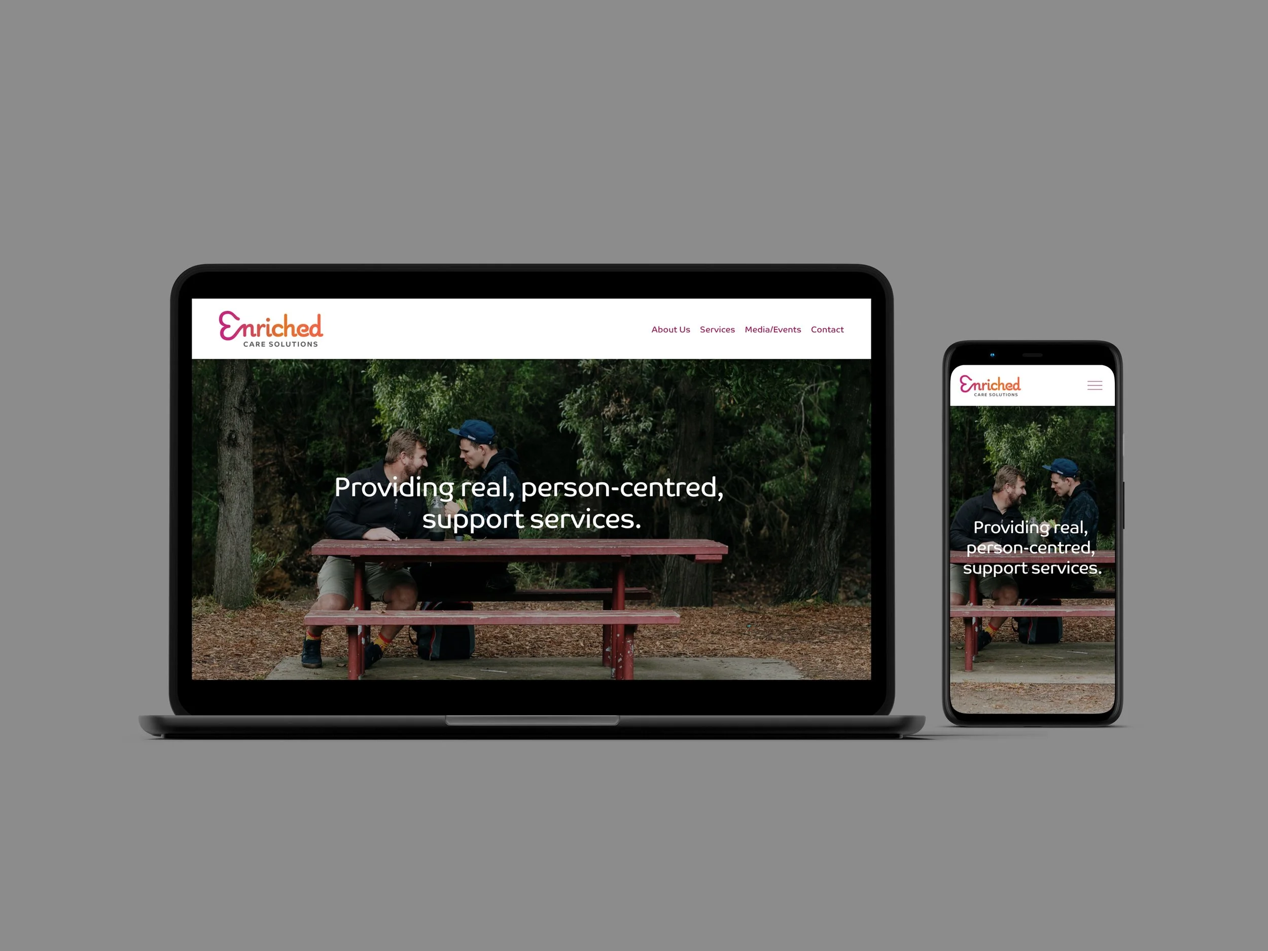
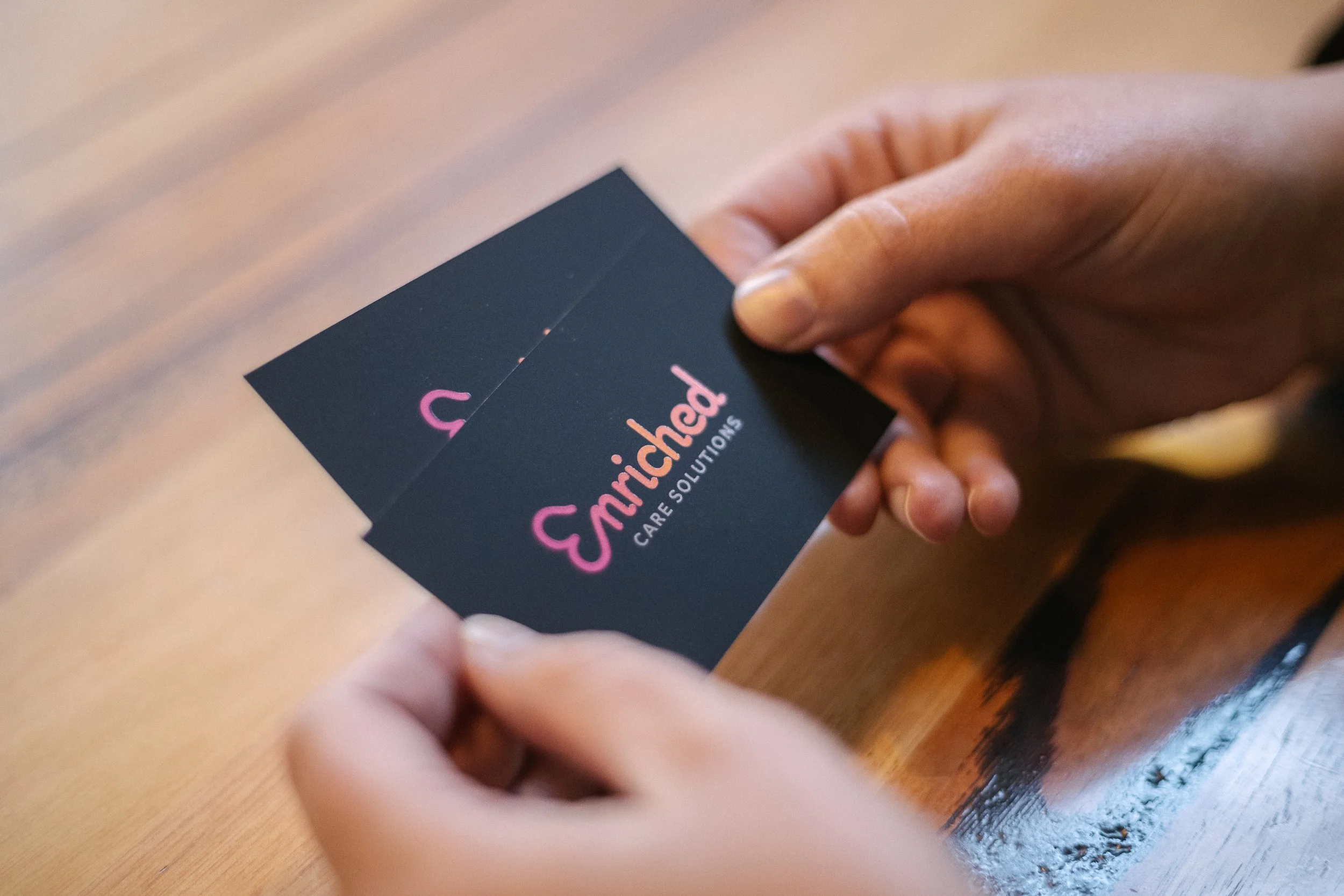
The logo features a sideways love heart forming the E, symbolising care and connection, supported by warm, approachable colours and professional typography.
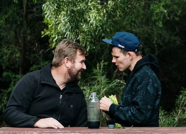
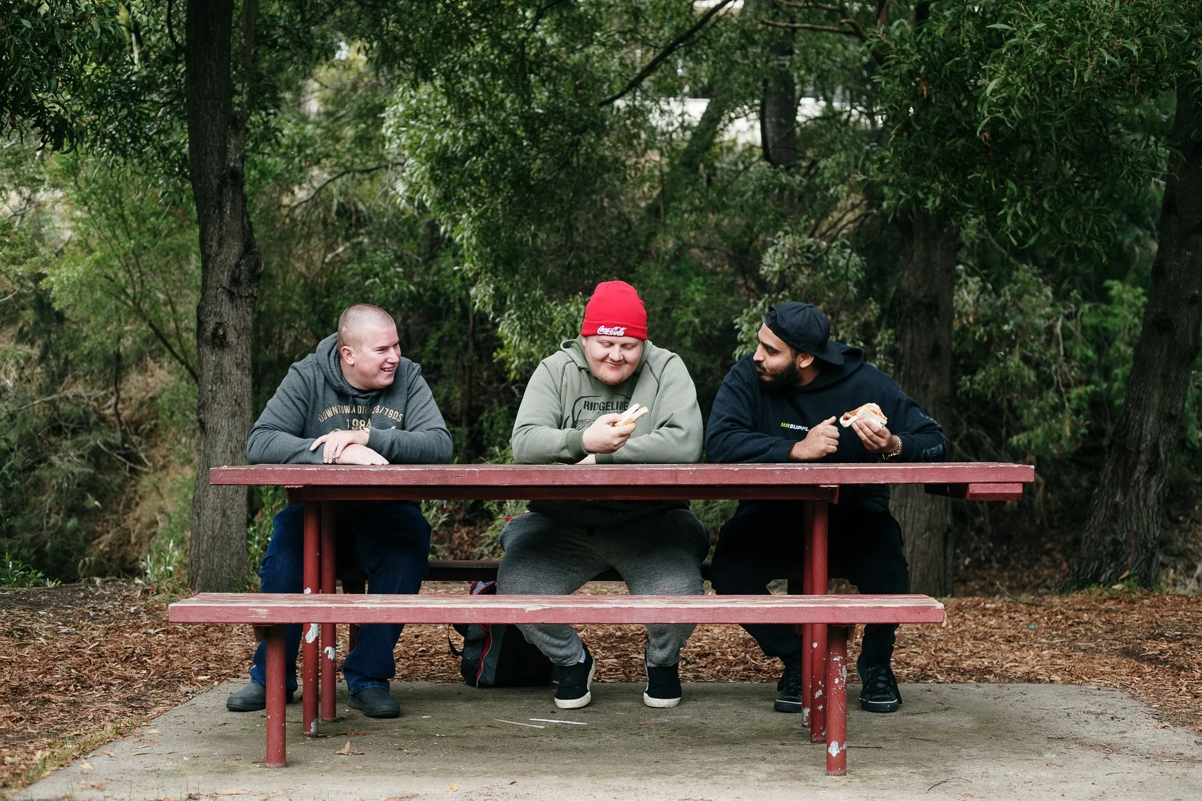
From there I designed the website, developed the style guide, and art directed multiple photoshoots with participants and staff – which required care, sensitivity and a lot of trust on everyone’s part.


THE RESULT
Before the rebrand, there was genuine confusion about what the organisation did and who it was for. That confusion is gone. The new identity gave participants, families, staff and referrers a clear, immediate sense of who Enriched Care Solutions are, what they stand for, and the level of professionalism they bring. The downstream impact has been tangible – stronger funding applications, increased referrals, and growth in the number of participants the organisation supports.