
AUDIT | STRATEGY | SIGNAGE SYSTEM
Flinders Island signage audit, strategy & style guide
THE SITUATION
Flinders Island's signage had grown organically over time – which is a polite way of saying it had become inconsistent, fragmented, and in some cases, absent altogether. The task was to audit what existed, make sense of it, and develop a strategy and style guide to bring it all into line.

WHAT WE DID
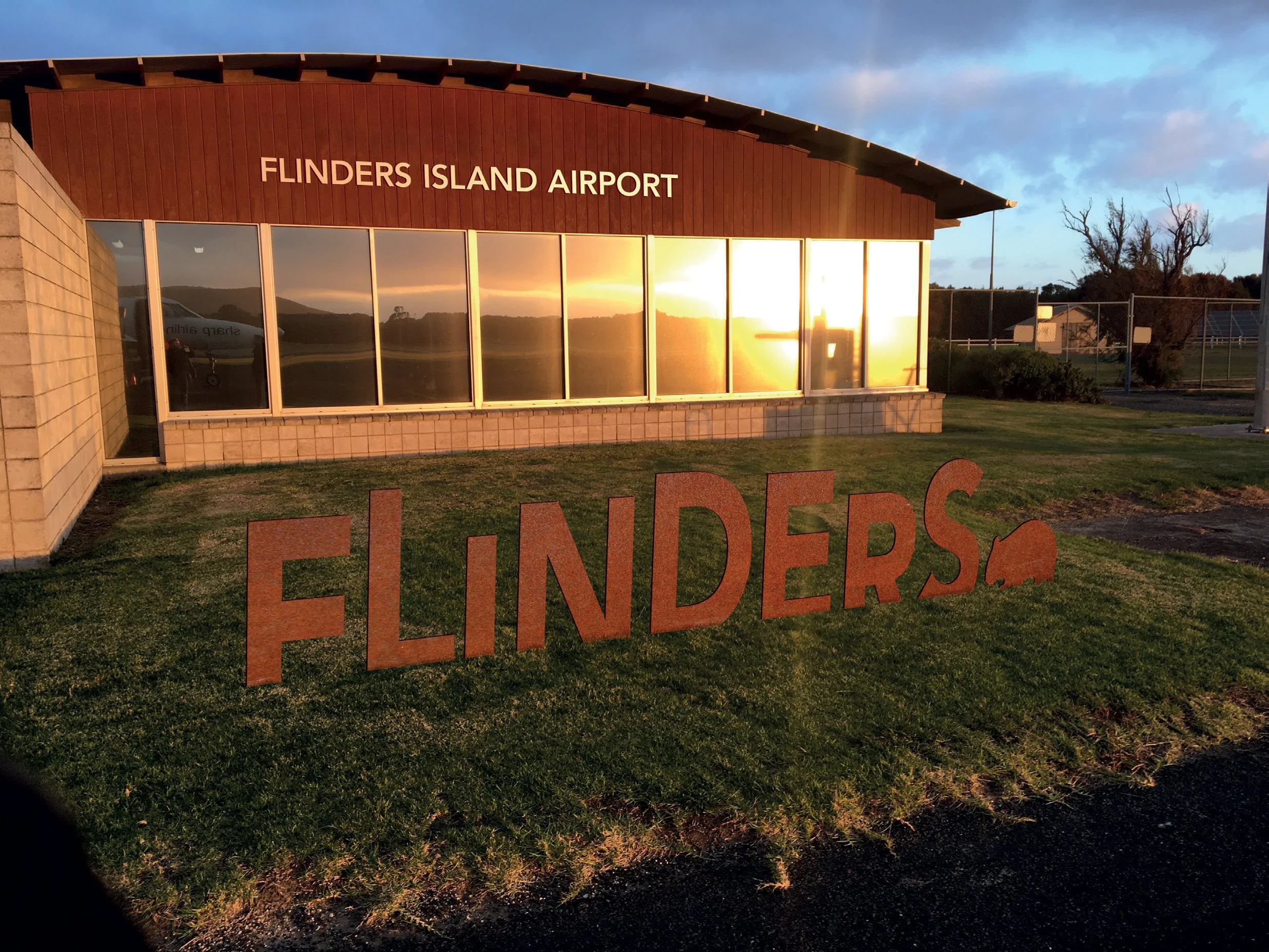
Alongside one team member and an external signage specialist, I travelled to Flinders Island to conduct an on-site audit of the full visitor experience – reviewing wayfinding, branding consistency, and sense of place across the island. It's a genuinely beautiful place to work, which helped.
What struck us almost immediately was how invisible the problems had become to the people who lived there. We'd flag something – the absence of a speed limit sign at the airport exit, for example – and the response would be "yeah, but everybody knows it's 80." That was a recurring theme. Everybody doesn't know. That's exactly why signage exists. Gently making that point, over and over, was as much a part of the project as the design work itself.
From the audit I wrote and designed a detailed report, developed strategic recommendations, created proposed signage concepts, and produced a comprehensive style guide and artwork suite.


THE RESULT
A clear, cohesive framework that gives the island's signage a consistent identity – and gives visitors the information they actually need to find their way around, including the speed limit.